
 |
| (Picture post card courtesy of Cardcow.com) |
The Rookwood Pottery was founded by "Maria Longworth Nichols Storer...in 1880 as a way to market her hobby - the painting of blank [china] tableware. Through years of experimentation with glazes and kiln temperatures, she eventually built her own kiln, hired a number of excellent chemists and artists who were able to create high-quality glazes of colors never before seen on mass-produced pottery." (http://en.wikipedia.org/wiki/Rookwood_Pottery_Company) One of the artists who worked for Mrs. Storer was Clement J. Barnhorn.
Clement J. Barnhorn (1857-1935) was born in Cincinnati, Ohio and was a student at the McMicken School of Design in Cincinnati, which later became the Cincinnati Art Academy. For eleven years he worked in marble and wood. He learned to carve wood while associated with Henry L. Fry, an English carver, and he studied sculpture with the Italian sculptor Louis T. Rebisso, both in Cincinnati. (Ernest Bruce Haswell, “Clement J. Barnhorn”, The International Studio, Vol. LV, No. 217, March 1915, XLIII-XLVII) In 1888 Barnhorn opened his own studio in Cincinnati. (Hans A Pohlsander, German Monuments in the Americas: Bonds Across the Atlantic, New German-American Studies, Vol. 33, Peter Lang, A.G., Bern, 2010, p. 118)
 |
| (Photo from Anna C. Minogue, “An American Sculptor--Clement J. Barnhorn”, The Rosary Magazine, Vol. XIV, No. 4, April 1899) |
“The genius of the young pupil...received the attention of the trustees of the Art Museum, and they [...gave] Mr. Barnhorn...an European art education. [...Much of his five years in Europe] was spent in Paris, where he [...studied] sculpture with Professors Dewys, Puech...and Professor A. Mercie; his drawing was prosecuted under the direction of Professors Bouquerau, Doucet and Brawtot.” (Anna C. Minogue, “An American Sculptor--Clement J. Barnhorn”, The Rosary Magazine, Vol. XIV, No. 4, April 1899, pp. 355-356)
 |
| A picture post card of Barnhorn’s “Magdalen” in the Cincinnati Art Museum. |
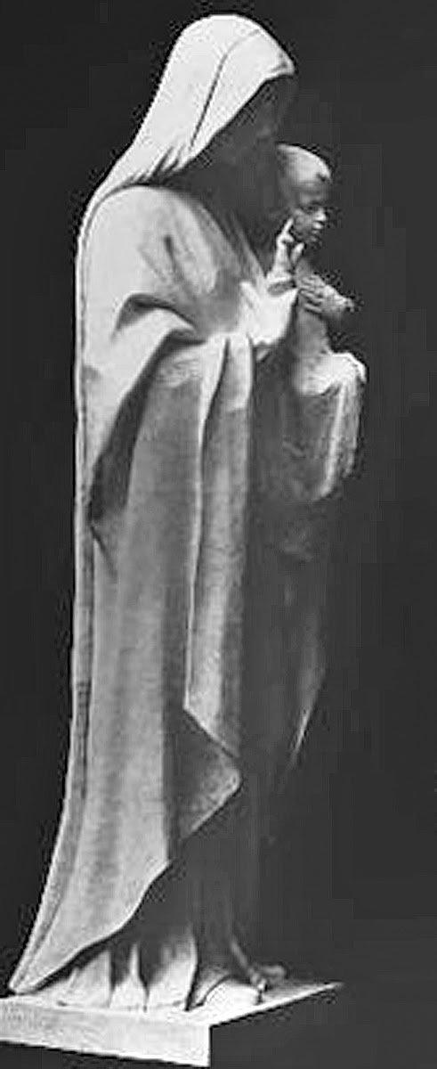
“Mr. Barnhorn’s first exhibition abroad was in 1894, when a bust of an old man was accorded place in the Paris Salon. [...The next year] he was again represented...by a nude figure,…’A Magdalene.’ This won...an ‘Honorable Mention’… . In 1895 he exhibited at the Salon a bronze relief of a Madonna.” (Minogue, p. 356)
 |
| "The Madonna of the Lily" (Photo from Minogue, p. 356) |
“Magdalen” was again exhibited in 1898 at the National Sculptural Exhibition in Manhattan where it was mentioned favorably by Charles De Kay in The New York Times. (Charles De Kay, “National Sculpture Exhibition, The New York Times, 15 May 1898) “A Magdalen” was then exhibited in the Paris Exposition of 1900 and was described favorably by the Brooklyn Daily Eagle: “The whole figure is in a position denoting grief and sorrow, by the careless, natural manner in which she has thrown herself upon the ground.” (“‘A Magdalen’ by Clement J. Barnhorn”, The Brooklyn Daily Eagle, 8 April 1900, p. 20)
 |
| Cambridge Art Tile Works, 6” square tile modeled by Clement Barnhorn. (Edwin Atlee Barber, Pottery and Porcelain in the United States, G.P. Putnam’s Sons, New York, 1901, p. 375) |
At some time after the founding of the Cambridge Art Tile Works in 1887, probably in the early 1890s, Barnhorn modeled art tiles for the Newport, Kentucky company, which was a few miles across the river from Cincinnati. Edwin Atlee Barber considered Barnhorn’s “King Lear” a superior tile.
Barnhorn’s major work was his sculpture--usually executed in metal, stone or ceramic faience. He was well known to the people of Northern Kentucky--even though he never lived there--where he has four major sculptures. “...Barnhorn immortalized [model Iola Leonard Sipple] as the Blessed Mother on the relief above the main doors at the Cathedral Basilica of the Assumption in Covington, and in the statue of Mary at St. Mary’s Catholic Church in Hyde Park.” (Linda M. Walker, “Portrait of Iola”, Cincinnati, Vol. 25, No. 8, May 1992, p. 38) “Bishop Camillus Paul Maes of the Diocese of Covington chose Barnhorn to design and create a statue for the pedestal between the two central doors of the front entrance of the new cathedral of Covington. The subject selected was the Madonna and Child. Made from Bedford limestone, the five foot tall sculpture, which has remained on the facade since 1912, took two years to complete.” (Chapter B of the Encyclopedia of Northern Kentucky, ed. by Paul A. Tenkotte and James P. Claypool; http://issuu.com/cincinnati/docs/nky-b/11)
 |
| ”Madonna and Child”, Covington Cathedral. (Ernest Bruce Haswell, “Clement J. Barnhorn”, The International Studio, Vol. LV, No. 217, March 1915, p. XLV) |
In 1915 Bishop Maes again asked Barnhorn to design a tympanum carving above the central doors of the cathedral. The Assumption of Mary into heaven was completed in 1917. It was 18 feet 7 inches wide by 13 feet 3 inches high and made of Bedford limestone. (Ernest Bruce Haswell, “Clement J. Barnhorn”, The International Studio, Vol. LV, No. 217, March 1915, p. XLV)
 |
| Facade with the two Barnhorn sculptures, St. Mary's Cathedral Basilica of the Assumption, Covington, Kentucky. “This cathedral was under construction in 1894-1915[ ...and] is modeled after the Cathedral of Notre Dame in Paris.” (Hans A. Pohlsander, German Monuments in the Americas: Bonds Across the Atlantic, New German-American Studies, Vol. 33, 2010. Photo uploaded to Wikipedia by Cobber17; http://en.wikipedia.org/wiki/Cathedral_Basilica_of_the_Assumption_(Covington,_Kentucky) |
The fourth major sculpture, completed in 1915, was “a large Crucifixion scene of bronze...in Covington’s Mother of God Cemetery. The crucified Christ, in agony, is looking upward toward heaven... .To his left St. John is looking up at him; to his right his mother appears to be weeping. Between them Mary Magdalene is kneeling.” (Hans A. Pohlsander, German Monuments in the Americas: Bonds Across the Atlantic, New German-American Studies, Vol. 33, 2010)
 |
| Barnhorn’s “Crucifixtion” in Covington’s Mother of God Cemetery. (Photo taken by Elice Feliz in 2008; https://www.flickr.com/photos/elycefeliz/2536313946/in/set-72157629215881165) |
In the summer of 1918 Barnhorn traveled to Taos, New Mexico to visit two of his Cincinnati friends, Ernest J. Blumenschein and Joseph Henry Sharp, part of the art colony there. While visiting, Barnhorn worked on a design for a sculpture which he called “Corn Dance”. “For this piece...Barnhorn hoped to capture the Indian culture that he witnessed first hand in Taos. ...Barnhorn viewed several dances, stating that their dances are wonderful but the most marvelous one I have seen is at San Domingo...it was called ‘The Corn Dance’ ...it was a gorgeous sight and thrilling like any great symphony.” This sculpture, as were others from about 1910-1918, was cast by the Roman Bronze Works foundry of New York. (http://www.cowanauctions.com/auctions/item.aspx?ItemId=101619)
 |
| ”Corn Dance” (1918) by Clement Barnhorn. (Cowan’s Auctions, 9/9/2011 - American Indian and Western Art, Lot 51; http://www.cowanauctions.com/auctions/item.aspx?id=101619) |
Early in the 20th century, Rookwood began producing a special line of tile work, Architectural Faience. Rookwood's Architectural Faience was introduced at the 1904 St. Louis World's Fair where its exhibit "was tilted steeply toward large architectural pieces. …In the display, large corbels and outsized moldings lay around like ancient ruins ready to be crated and shipped to the British Museum." (Richard D. Mohr, "Rookwood Faience Tiles: Their History, Designers, Techniques, and Styles--Part I", Journal of the American Art Pottery Association, Vol. 26, No. 1, Winter 2010, p. 16)
Architects were not limited to the very large faience pieces, though. "[They] could buy a few individual tiles for mantels and the like, or much larger works such as [Clement] Barnhorn's ‘Fountain of the Water Nymph’.” (http://enquirer.com/editions/2003/05/16/tem_rookwoodfountain.html)
 |
| The Rookwood Architectural Faience exhibit at the St. Louis World's Fair in 1904. (Brick and Clay Record Vol. XXXVII, No. 11, June 1, 1911, p. 522) |

”Fountain of the Water Nymph” (1903), created in architectural faience by sculptor Clement J. Barnhorn (1857- 1935). Barnhorn created other sculptural works in architectural faience for Rookwood which were installed in the Lord and Taylor store in Manhattan, the Prince George Hotel in Manhattan, the Kauffmann-Bauer Fountain in Pittsburgh, the Holmes Fountain in Cincinnati, and a lunette for the Sailors’ Institute in New York, among others. (Ernest Bruce Haswell, “Clement J. Barnhorn”, The International Studio, Vol. LV, No. 217, March 1915, p. XLVI) This fountain was part of the Rookwood showroom from 1913 until 1967, when Rookwood closed its doors in Cincinnati. In 1992 it was rediscovered by Anita J. Ellis of the Cincinnati Art Museum in an antiques store, and it was purchased by the Museum. (John Johnston, “Rich in history, artwork finds home”, The Cincinnati Enquirer, Friday, May 16, 2003; http://enquirer.com/editions/2003/05/16/tem_rookwoodfountain.html)
Barnhorn did design individual and series of tiles such as his Mermaid tiles, which were produced in two sizes, 12” x 12” and 14” x 14”. These are pictured at the bottom of page 8 of the 1907 Rookwood Catalogue. On page 19 are the prices for these tiles in both sizes and in “A” and “B” single colors and in more than one color.

According to decorative arts historian Richard Mohr, Rookwood’s architectural faience color range--at least until about 1910--had greater chromatic possibilities than the other companies that produced architectural terra cotta. However, architectural terra cotta was less expensive than Rookwood’s faience because it was only fired once, while faience had to be fired at least twice: the bisque firing and the firing after the glazing. Rookwood’s faience never attained the amount of exterior use as did terra cotta, and very few buildings used its faience for exterior trim. “Rookwood did much better with interiors, including a fair number of total tile installations where walls, floors, ceilings, and fixtures were all faced with its faience... .” Some of these were the dining room in Cincinnati’s Hotel Sinton, the Rathskeller in Louisville’s Seelbach Hotel, and the Norse Room in Pittsburgh’s Fort Pitt Hotel. (Richard D. Mohr, “Rookwood Faience Tiles...--Part I”, Journal of the American Art Pottery Association, Vol. 26, No. 1, Winter 2010, p. 22) Only the Seelbach installation still exists.
 |
| Rookwood's Class "A" Colors. (Courtesy of Vance A. Koehler and Richard Mohr) |
In October 1924 Rookwood printed a "Classification of Colors as to Price" on which are noted Class "A", "B" and "C" Mat Glaze colors for Rookwood Faience. Richard Mohr writes, "…we know that the Class B colors were more expensive than the more numerous Class A colors. Presumably the Class C colors, 'Chavannes Tones and other specialties,' were more expensive still." (Richard D. Mohr, “A Rookwood Color Chart -- in Color: A Documentation”, Journal of the American Art Pottery Association, Vol. 26, No. 4, Fall 2010, pp. 14-16)
 |
| Rookwood's Class "B" and Class "C" colors. (Courtesy of Vance A. Koehler and Richard Mohr) |
Some of Barnhorn’s more interesting ceramic creations are his faience fountains. A number of these can be found in the Cincinnati schools such as Hughes High School.
 |
| (PPC in the Public Domain: http://en.wikipedia.org/wiki/File:HughesHighSchoolCincinnati.PNG) |
“When Hughes High School opened its doors in 1908, its eight-story square tower was the tallest structure in Clifton, a monument to the lofty regard community leaders held for the enterprise of education. Today the school houses 1,525 students and remains an indelible part of the educational neighborhood which surrounds it. Hughes High School is also one of [Cincinnati’s] most notable examples of Tudor architecture.
 |
| Twelve Rookwood faience fountains in the Cincinnati Public Schools. Hughes High School has twelve of its own. (Poster courtesy of the Rookwood Pottery.) |
“A dozen wall fountains bookend hallways throughout the original three-story structure, dubbed the ‘classical building’ by staff and students. Each fountain was donated to the school by a graduating class or, in the case of the Dinkelaker Rookwood Fountain, the family of a deceased alumnus.” (Andy Knight, “Must See: Hughes High School”, The Cincinnati Enquirer, Nov. 1, 2001; http://www.cincinnati.com/visitorsguide/stories/110101_mustsee.html) The “Boy and Dolphin” fountain (middle row, first on the left) was designed by Clement Barnhorn. The figure on the top of the fountain is very similar to the Rookwood fountain that Barnhorn designed for the Prince George Hotel in New York City.
The Prince George Hotel
 |
| The Rookwood fountain in the Ladies Tea Room/Palm Room. (Architectural Review, Vol. 2, No. 4, April 1913, p. 164) |
The Prince George Hotel at 9-15 East 27th Street and 10-14 East 28th Street in Manhattan was designed by architect Howard Greenley and “when the hotel opened in 1904..., it was a Beaux-Arts jewel reminiscent of Edith Wharton’s New York. The luxurious rooms on each of its 14 floors came with private baths, and the ground floor featured several restaurant and lounge areas.” (https://ephemeralnewyork.wordpress.com/tag/prince-george-ballroom/) “The Prince George Hotel...was one of those destined-to-be-destroyed treasures as it sat decaying for years in the early 1990s... . Once a lavish hotel...The Prince George fell on hard times in the 1970’s when it was purchased and converted by New York City into a welfare hotel—one of the most dangerous and notorious in the city. ...The Prince George’s second chance at recapturing its former elegance occurred several years later when the non-profit Common Ground, an organization dedicated to developing and sustaining supportive and affordable housing for the chronically homeless in New York, purchased the vacant building from the city—its second converted residence at the time.
 |
| Palm Room, Prince George Hotel in 1913. (Architectural Review, Vol. 2, No. 4, April 1913, p. 164) |
“In collaboration with the Preservation League of New York State and New York Landmarks Conservancy, along with $39 million of private, state, and federal funds, Common Ground and Beyer Blinder Belle (the architects behind the Grand Central Station renovations) were able to successfully convert the decrepit building back into a livable residence with 416 single occupancy apartments.” (Corey William Schneider, “The Many Lives of NYC’s Historic Prince George Hotel, Now Affordable Housing for the Homeless”; http://untappedcities.com/2014/03/26/the-many-lives-of-nycs-historic-prince-george-hotel-now-affordable-housing-for-the-homeless/)
 |
| This room featuring stunning arched ceilings, warm orange illuminated sconces, and Rookwood fountain and murals by George Inness, Jr., was used as a building storage locker. (Corey William Schneider, “The Many Lives of NYC’s Historic Prince George Hot el, Now Affordable Housing for the Homeless”; http://untappedcities.com/2014/03/26/the-many-lives-of-nycs-historic-prince-george-hotel-now-affordable-housing-for-the-homeless/; Photo by Ben Helmer for Untapped Cities) |
By the time Common Ground purchased the Prince George, however, many of the original decorative works of art had been removed by previous owners or destroyed according to Jeff Scheuer, the Common Ground Vice-President for External Affairs. (Email from Mr. Scheuer to the author dated 8 November 2014)
 |
| Detail of the ceramic faience “Boy and Dolphin” fountain in the Prince George Hotel. (The Architectural Record, Vol. XXI, No. 1, January 1907, p. 68) |
 |
| Rookwood probably made many similar copies of the “Boy and Dolphin” ceramic sculpture, like this one. (Humler and Nolan’s Holiday Sale 2014 Rookwood Session, Lot 1485, Rookwood Boy and Dolphin, 1912, Ombroso, 15”; http://www.liveauctioneers.com/item/31187558_rookwood-boy-and-dolphin-1912-ombroso-15) |
This 15” high “Boy and Dolphin” sold in auction in 2014 was made in Rookwood’s “Ombroso” glaze. According to Rookwood expert Anita Ellis, the Ombroso glaze line was used from about 1909 to 1930. It was applied to a faience body that was light buff to white in color. The glaze, itself, had a blue-gray quality, and Harold F. Bopp, the Rookwood ceramics engineer, “tells us that often crystals large enough to be seen would separate out of the glaze as a different color, giving the impression that two or more glazes of different colors were used. The different colors can range from pinks, reds, yellows and greens, to blues, grays, blacks and browns. ...Almost all of Rookwood’s mat production between 1910-1916 is in the Ombroso line.” (Anita J. Ellis, Rookwood Pottery: the Glaze Lines, Schiffer Publishing Company, Atglen, PA, 1995, p. 91) Could the Palm Room fountain in the Prince George Hotel also have been a very early work in the Ombroso glaze?
 |
| A Barnhorn “Boy and Dolphin” fountain pictured on p. 64 of the 1912 Rookwood Faience Catalog reprinted by the Tile Heritage Foundation in the 1990s. The figure was priced at $200, and the shell base was extra. (Photo courtesy of the Tile Heritage Foundation) |
Lord and Taylor, 424 Fifth Avenue, Manhattan
 |
| (Photo by Jim.henderson (Own work) [Public domain], via Wikimedia Commons) |
Clement Barnhorn designed another Rookwood ceramic fountain for the Cut Flower Department of the Lord and Taylor department store in Manhattan in 1913.
 |
| The Flower Shop with the faience heat grill at the left. It is thought that the niche in the wall past the heat grill may be where the Barnhorn fountain was placed. (Photos of Lord and Taylor are from “Burned Clay Decoration in a New Field”, Brick and Clay Worker, Vol. XLIV, No. 10, May 19, 1914, pp. 1156-1157, unless otherwise noted) |
The architects--Starrett & Van Vleck--designed the building for Lord and Taylor on Fifth Avenue between 38th and 39th Streets. Rookwood finished the entire Cut Flower Department, a 15’ x 30’ x 8 1/2’ space, in architectural faience.
 |
| The Cut Flower Shop was to the right of the staircase. The refrigeration units are to the left, center of this photo. The Barnhorn fountain could have been placed in the area at the extreme left--at the head of the staircase, or in a niche in the wall in the hallway straight ahead. (Photo in the Public Domain; courtesy of Richard Mohr) |
“The general color tone is a soft gray. The ceiling is finished in six-inch tiling of this color, and the walls, in part, and floors are also covered with a gray tile. A number of beautifully-modeled pilasters, in a massive but graceful design, fill in one side of the room, serving to mark off the compartments in which the refrigerators for the cut flowers are kept. These pilasters are about 7 ft. 6 in. in height, and form a striking architectural feature of the room.” (“Burned Clay Decoration in a New Field”, Brick and Clay Worker, Vol. XLIV, No. 10, May 19, 1914, p. 1156. According to decorative arts historian Richard Mohr, B&CR incorrectly identifies the Rookwood Lord and Taylor with Rookwood faience as being located in Cincinnati. Mohr states that B&CR was actually writing about the Manhattan store. See Note 8 in Richard D. Mohr, “Rookwood Faience Tiles: Their History, Designers, Techniques, and Styles--Part III”, Journal of the American Art Pottery Association, Vol. 26, No. 3, Summer 2010, p. 22)
 |
| The faience heat grill. |
“Probably the most conspicuous piece of artistic pottery...is the big heat grill in the center, at one side, which serves the same purpose as the ordinary iron affair... . It measures about 64 in. long by 50 in. high, and is surrounded by a molded border of elaborate design... . The grill itself...bears as its central figure a graceful urn, the space being filled out by conventionalized vines, leaves and bunches of grapes, with figures of birds and squirrels on both sides of the central figure.” (“Burned Clay Decoration in a New Field”, Brick and Clay Worker, Vol. XLIV, No. 10, May 19, 1914, pp. 1156-1157)
 |
| A Rookwood pilaster in polychrome faience. (Photo in the public domain; courtesy of Richard Mohr) |
All of the special moldings in this room, except for the ceiling and floor tiles, are colored in natural colors of “rich blues, greens, reds and yellows, with more subdued tints, being used liberally.” (“Burned Clay Decoration in a New Field”, Brick and Clay Worker, Vol. XLIV, No. 10, May 19, 1914, p. 1157) The principal figures of Barnhorn's faience fountain are a “seated figure of a nymph, about two-thirds life size, with a satyr playing on his pipes, ...while the background, in the fresh colors of Spring, will set the picture off fittingly.” (B&CW, p. 1157)
 |
| This is the fountain designed by Clement Barnhorn for the Lord and Taylor in Manhattan (Ernest Bruce Haswell, “American Pottery A Recent Development of Faience in the Middle West”, The Art World, Vol. III, No. 1, October 1917, p. 78) It also is similar to the “Fountain of the Water Nymph” (1903) now in the Cincinnati Art Museum. |
Starrett & Van Vleck designed the ten story building in the Italian Renaissance style for Lord and Taylor. “The view from any entrance to the interior of the main floor is exceptionally attractive. ...There is a beautiful staircase, at the extreme rear, leading up to the Cut Flower Balcony. This balcony and its fittings, as well as the exquisite fountain at the head of the stairway is all in Rookwood Faience, kept in soft delicate coloring.” (“Architectural Criticism”, Architecture, Vol. XXIX, No. 4, April 1914, p. 77)
 |
| Staircase and Cut Flower Balcony. (From Architecture, Vol. XXIX, No. 4, April 1914, Plate L; courtesy of Richard Mohr) |
Although this room was considered an “original work” by Rookwood, the pilasters and Barnhorn’s fountain were reproduced for sale to other customers, and they were assigned stock numbers in Rookwood’s “Record Book of Shape Numbers for Faience Tiles”. (Richard D. Mohr, “Rookwood Faience Tiles: Their History, Designers, Techniques, and Styles--Part III”, Journal of the American Art Pottery Association, Vol. 26, No. 3, Summer 2010, p. 22, Note 8)
Lord and Taylor still exists at this location in Manhattan, but, until recently, we did not know what happened to the Rookwood Flower Shop*, nor to the other, unidentified Rookwood installation in the building (possibly the column capitals on the main floor). Until the development of the preservation movement in the 1960s and 1970s the old was just trashed during a renovation or demolition. There was usually no attempt to save “worthless” decorative elements of a building, such as the Rookwood-clad Norse Room in the Fort Pitt Hotel in Pittsburgh in 1967. (https://sites.google.com/site/tileinstallationdatabasemz/pa__pittsburgh--the-norse-room-fort-pitt-hotel)
 |
| A Rookwood faience tile mural once part of the Fort Pitt Hotel's Norse Room (demolished). (http://tileresearcharticles.omeka.net/items/show/7--scroll down to "Files" and click on the pdf document) |
Even in today’s enlightened times developers still destroy the old in order to gain more profit from the new. A case in point--the developer of 16 East 41st Street in Manhattan recently ripped off the American Encaustic Tile Company’s tiled/ceramic facade so that the building couldn’t be landmarked and protected. The tiles and ceramics, which were designed by Leon Solon, were, of course, trashed.
*A ceramic arts treasure rediscovered
Actually, I did discover what happened to the Rookwood faience and tiles in the original Lord and Taylor Flower Shop. Some of it is still there, painted white and hidden behind walls made from wallboard in what is now a storage area.
 |
| The staircase to what was the Cut Flower Shop in 1914. The bannister metal work may or may not be original, but the metal sculpture in the center was originally one of two newel posts on this stairway in 1914. |
If you enter Lord and Taylor at Fifth Avenue and walk to the back of the ground floor, the staircase to the old mezzanine and Rookwood-clad Flower Shop and balcony is still there. The staircase leads to what looks like a storage area, and to the balcony, which is above the staircase.

(A week after I walked up this staircase, it was mostly hidden by a floor-to-ceiling display.)
(A week after I walked up this staircase, it was mostly hidden by a floor-to-ceiling display.)
 |
| We don’t know if there’s any Rookwood Faience under the balcony wallboard, but there may be. |
 |
| The balcony. |
 |
| The storage area that used to be the Cut Flower Shop. |
The Flower Shop and its refrigeration units were in the area to the right of the staircase. The walls are made of wallboard. The door at the back of this photo leads to a small hallway where you can see some Rookwood Faience.
 |
| A 7’6” high Rookwood faience pilaster, wall and ceiling tiles, and faience border decoration. |
Everything is painted white, the tiles on the walls and ceilings, the pilaster, and the border faience. When the door is closed slightly, you can see where the faience continues behind the wallboard--in white, rather than the original brightly-colored glazes.

What we cannot see, however, is how much of the faience remains intact, or if the Barnhorn fountain is in a wall niche behind the wallboard.

In addition, the capitals of the columns on the ground floor may be original Rookwood Faience decorative elements, and the decorated bands across the ceiling may be original plaster decorations from 1914.

 |
| The capitals and decorative bands (above) and decorative plaster elements in a ceiling band (below). The hanging lights seem to be the original lights from 1914. |


Now that this ceramic work of art has been located, will Lord and Taylor preserve it or... ? I did send an email to two of the Lord and Taylor executives about the Rookwood faience and fountain, but have not received an answer, yet. I also visited Lord and Taylor with Eve Kahn, the "Antiques" columnist of the New York Times and showed her the Rookwood faience. She wrote of this discovery in The New York Times. (http://www.nytimes.com/2014/12/05/arts/design/at-lord-taylor-a-peek-at-bygone-ceramic-splendors.html?_r=0)
A few years before Barnhorn died in 1935, he completed a series of odd sculptures for the Sayers and Scovill automobile company. In 1929 S&S built a Signed Sculpture Hearse and commissioned Barnhorn to create the car’s most distinctive styling feature: “large cast bronze Angel of Memory panels mounted on the sides of [the] regal hearse.” Barnhorn signed each sculpture personally--hence the car’s name. The Signed Sculpture hearse cost $8500, but the Great Depression cut into sales. By 1931 the signed sculptures were gone. (The Professional Car, Fourth Quarter, 2009, p. 1)
 |
| The Sayers & Scovill 1929 Signed Sculpture Hearse. (Photo from the collection of Thomas A. McPherson. This is the cover photo from The Professional Car issue) |
*****
Acknowledgements
My thanks to Richard Mohr for the 1914 Lord and Taylor scans, and for his help understanding Rookwood colors and glazes; and thanks to the Tile Heritage Foundation for reprinting the Rookwood catalog, and other tile company catalogs. I would also like to thank Eve Kahn, the “Antiques” columnist for The New York Times, for her help.
Suggested Further Reading
Richard Mohr’s series of articles about Rookwood Faience and Tiles in the Journal of the American Art Pottery Association are very well researched and documented:
Richard D. Mohr, “Rookwood Faience Tiles: Their History, Designers, Techniques, and Styles--Part I”, Journal of the American Art Pottery Association, Vol. 26, No. 1, Winter 2010.
Richard D. Mohr, “Rookwood Faience Tiles: Their History, Designers, Techniques, and Styles--Part II”, Journal of the American Art Pottery Association, Vol. 26, No. 2, Spring 2010.
Richard D. Mohr, “Rookwood Faience Tiles: Their History, Designers, Techniques, and Styles--Part III”, Journal of the American Art Pottery Association, Vol. 26, No. 3, Summer 2010.
Richard D. Mohr, “A Rookwood Color Chart--in Color: A Documentation”, Journal of the American Art Pottery Association, Vol. 26, No. 4, Fall 2010.
Anita J. Ellis, Rookwood Pottery: The Glaze Lines, Schiffer Publishing Ltd., Atglen, PA, 1995.


